
I have mixed feelings about Full Site Editing themes; I’ve shared that before on this blog. It doesn’t fit into my workflow with hybrid themes. And I see a lot of shortcomings, especially when it comes to conditional logic. For example, if you add an icon block to an “in stock” block, you get “x 30 in stock.” But for products that don’t have inventory management, only the icon appears. Weird.
As a shop builder, it’s just really strange to be at the mercy of (database) templates without seeing any “real” code that you have 100% control over—and that you know will withstand updates and new features. Plus, you know your clients won’t mess with it.
So does FSE fit my customers’ target audience?
Yes, absolutely. For small shops, it’s definitely an option.
But I’m also seeing a serious growing trend among my customers. More and more shop owners are getting hands-on with code themselves—simple AI code to add something to a single product page or category page.
A hybrid theme is perfectly suited for that, to accept and “get” that code. And a FSE-theme does not have the hooks in places you/AI will expect.
So I’m wondering out loud whether the AI train is racing the FSE for WooCommerce out of the circuit.
Then show me what FSE can really do!
Woo is really going all in to promote FSE. It took a while, but welcome, Purple Theme!
I’ve tested Purple, and overall I think it’s a great theme.
But a day without grumbling is a day not lived 🙂
I find the included WooCommerce templates rather ordinary. I have mentioned this before in the first draft of the official WooCommerce FSE theme.
They don’t showcase FSE’s full potential. For that reason, I suggested showing a version that—in my opinion—is better. So, that’s why this blog article.
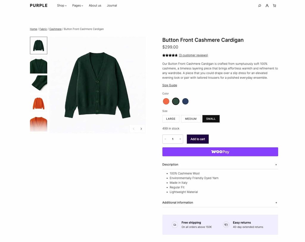
This is the demo layout of the single product page, the official one.
This is my demo example
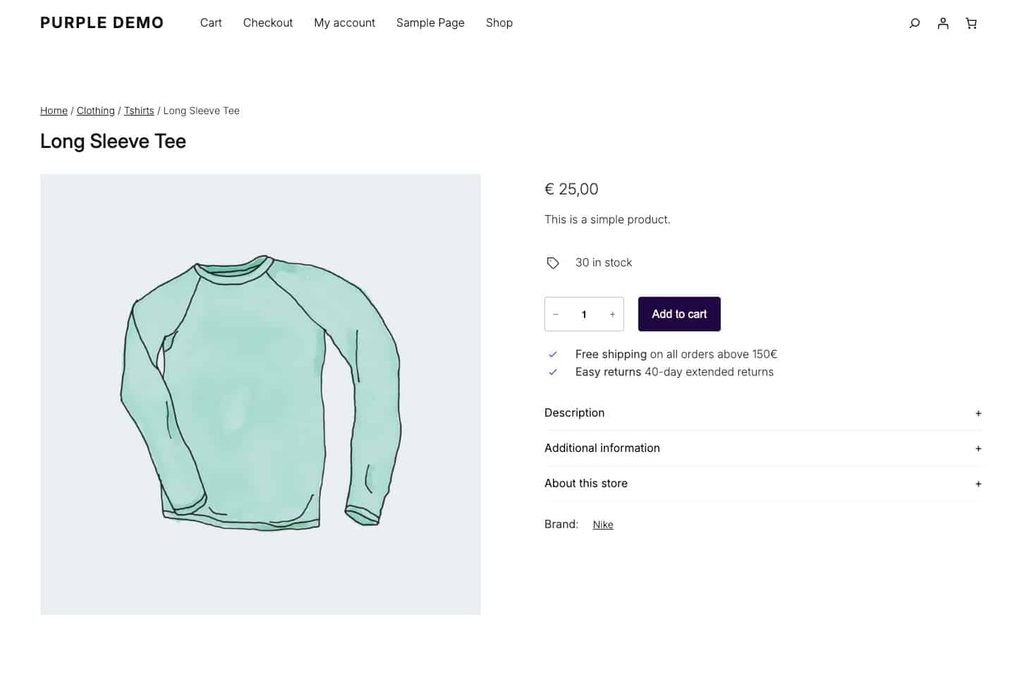
A summary of my improvements:
- The “Add to Cart” button is now more visible. I see this mistake happen a lot, and every time we improve this aspect, we see a rise in conversions. The old trick is: step back 2 meters from your screen; what stands out the most? The answer should be: the button!
- The product title appears above the image. For years, WooCommerce placed the title in the right-hand column by default. But mobile visitors (the majority) see the title at the bottom of the photo. That’s not good for conversions. Ideally, the image on mobile shouldn’t be full-screen either, so that the content at the bottom is more visible in the viewport. This is really important—we’ve seen huge improvements in conversion rates as a result. 60% of your visitors don’t scroll past the 50% mark on your screen.
- The text for “Free Shipping” and “Easy Returns” should be as close as possible to the button. Those are the words that dispel the buyer’s doubts. Just like the stock image.
- In the “official” demo under “Free Shipping and Easy Returns,” two images have also been added. Huh? Why? Promote the icon block—this way, other themes will pick it up too. Something Ollie has understood well, by the way.
- Purple’s color scheme is… well, mostly purple. I’m missing conversion-friendly colors here. And no, it’s not a cliché. Green checkmarks work in most cases. So if possible, Purple should have a more varied color palette out of the box—including green.
- Collapse the long description. Don’t create too many distractions. And if a visitor does click on the accordion to expand the long description, that’s a clear sign they’re genuinely interested in the product.
- Why not add a tab? Like “About My Store.” Basically, the product pages are the most visited pages in your entire store—thanks in part to Google Shopping. So always introduce your company on your product pages. Give your company a face.
- Brands are very interesting to display on product pages. They create recognition for the visitor. The first click has been made. So always display them on the product page. Ideally, even with a logo, but I don’t think that’s possible yet with that block.
- Lately, I’ve been obsessed with design consistency. For one particular shop, we really took this to the extreme: the same padding, margins, font size, radius, color palette, etc., everywhere. The owner of that shop had a background in graphic design, which is why he was so particular about it. Honestly, I was surprised by the result myself, and we actually saw an increase in conversion rates. So when I look at a demo and the quantity counter has a border-radius (4px) applied by WooCommerce, but the “Add to Cart” button doesn’t (0px), I start to frown because I realize just how important design consistency is. Note after i wrote this: seem like the next version of WooCommerce will have border-radius option for this quantity block. Great!
- About the “add to cart” button width: I couldn’t get it to fill the column width. I tried 100%, various other settings, a global 100% — nothing worked. It’s kind of frustrating: 20 years into a professional web design career, and FSE can still make me feel like a rookie. 🙂
- Then I looked at the HTML output of the add-to-cart button. Wow, that is a big chunk of html. I’m sure there’s a reason for it, but OMG, comparing it to the “classic” way or the Shopify-way, where you just see a button and a class… isn’t readable html important or not (for bots).
- My example is just a first draft, but I think there’s room for many more core blocks to showcase the power of FSE.
My suggestions for the category page.
- The demo itself is great; it’s exactly what it should be.
- I might change the product title to a different color, though. Take a look at the high-volume stores—they often use that technique.
- I’d even remove the button. It’s too flashy and distracts from the more important elements. A button needs to be highly visible on a product page, not so much on a category page.
- I’d also make better use of the sidebar. In my test, I noticed there isn’t a “also viewed products” block yet… that’s a bummer. But the sidebar definitely has room for personalization—a photo of the store owner, the specialist, etc.
So, that’s it.
I’ll keep my eyes on FSE, for sure.
My favorite theme for building WooCommerce stores remains Shoptimizer. It’s been a while i’ve build custom shops from the ground up. Since my introduction to Shoptimizer i never had a project that really needs custom all the way.
Within a few weeks i also launch my first FSE WooCommerce project. FSE suited on that as the shop has only 5 products, all centered around a book for little children. So, FSE made it possible to easily adjust the shop index page, etc. I see potential. But as i’ve written in previous article, i bump into the FSE limitations of the header-part for e-commerce shops.

Leave a Reply